BF's Take:
When I think of great logos I think of an image that describes a team *WITHOUT* lettering. Another thing that great logos need is *SIMPLICITY* & *BALANCE*, most great logos are *usually* balanced. A balanced logo is usually helmet worthy. One last thing to take into consideration, is the logo unique and cool enough that the vast majority would notice what that logo meant if the schools name isnt listed under it. Lets take the Big Sky for example.

EWU- Good balance & creativity. IMO ppl would associate it to Eastern Washington University.
ISU- (taking "ISU" away)-Great creativity & balance even w/the burst lines.but there are tons of tiger logos out there.
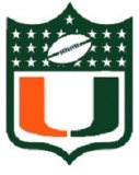
UM-(taking the phase away) Creative but not balanced/NOT helmet worthy.
MSU-Great creativity but not balanced. This logo does make you think of MSU.
NAU- Technically NAU only has the 'axe' which isnt bad, but they should add more to the logo. the axe is a good start.
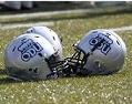
UNC- The bear does make you think of UNC but it isnt balanced or simple & is not helmet worthy.
PSU- Great creativity & simplicity but is not balanced, looks cool on helmet but should be balanced out in some way.
CSUS-Not very creative but it is unique & makes you think of Sac st. I think the fat hornet was the better logo.
WSU-The Shield is awkward but is unique & balanced. Removing 'Weber State' makes it helmet worthy.
Conclusion-MSU's 'M' with the triple stripe is the best helmet in the Big Sky. Second is EWUs creative Eagle. UM got beat to the 'M' punch by MSU bc technically that should be Montana, bc usually the 'State' school doesnt get that plain state letter. ex Michigan, Arizona, Washington, Oregon, Florida... the list goes on.