CatMom wrote:Nice improvement there UCABEAR. Have to admit the old one was kind of High School.
Looking at the twitter page I kinda like the UCA with just the bear head under it.
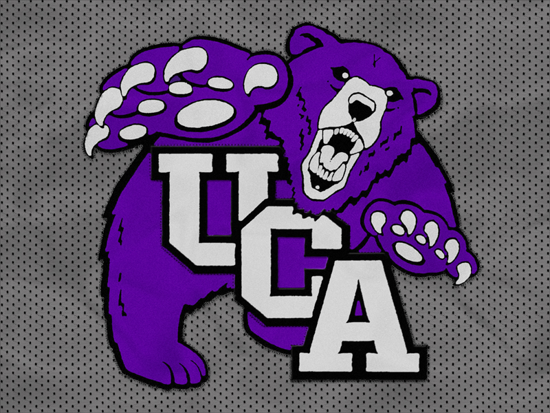
UCA just finished a capital fundraising campaign with the goal of raising $35 million dollars and exceeded that with nearly $37 million. A private donor paid a designer $10,000 to design the new logo and it has versatile variations, some like you said. The old logo has been around since UCA had a couple thousand students when it was NAIA. It's a nice change for a university so young in division I. Now if we could get the product on the field, courts and courses to match! (Well, except girls bb, volleyball, and golf).
I think other universities have the paw idea also. Plus it's hard to come up with a variation of the "PAW" when it's a bear..guess that just goes with both schools having a bear as mascot.
When Willie showed me this logo yesterday my immediate thought was "they sniped this idea from someone else." Then Willie pointed out that Baylor's looks almost the same. C'mon guys, originality!! But it's still an improvement over the last.. though, the older logo was cool and original.
Seriously I don't think there's too much you can do with an animal logo that hasn't been done before. You use one aspect of the animal and one aspect of the school name. Even the old logo looked kinda like the Kentucky one, just a different animal. A UCA private donor paid a designer $10k to come up with this idea. It is better than the old one and a change was needed. I'll take it for now.
It's always bugged my why UNI's designer didn't extend the bottom of the I and connect it to the panther like he/she did with the U.
Part of that is because the UNI and the panther are use separately as logo's themselves I'm guessing. That doesn't both people as much as the back top tooth being shaded in but the rest aren't.