Page 1 of 2
NCAA logos
Posted: Fri Feb 04, 2011 4:44 pm
by Wildcat Ryan
What are some of your favorite NCAA logos? I have a list of some of my favorite logos
Army Black Knights

Indiana Purdue Fort Wayne Mastadons

Southern Utah Thunderbirds

Binghamton Bearcats

LSU Tigers

Fairfield Stags

I hate the school, but I do like this Logo. Utah State Aggies

The Most creative logo In my mind, and MUCH better than Wash St's. Eastern Washington Eagles

Montana Grizzlies

Boise State Broncos

Old Dominion Monarchs

New Mexico Lobos

And the best (call me a homer if you like) logo of them all....
Weber State Wildcats

Those are some of my favorites, what are yours?
Re: NCAA logos
Posted: Fri Feb 04, 2011 5:34 pm
by nwFL Griz
No way the EWU eagle is better than the WSU cougar.
Re: NCAA logos
Posted: Fri Feb 04, 2011 5:39 pm
by Skjellyfetti
Re: NCAA logos
Posted: Fri Feb 04, 2011 6:29 pm
by AlwaysAGriz
nwFL Griz wrote:No way the EWU eagle is better than the WSU cougar.
i agree. the WSU one is a classic. although ewu is pretty cool too. they're simple to draw too!

Re: NCAA logos
Posted: Fri Feb 04, 2011 6:53 pm
by SuperHornet
I gotta admit the first few times I saw the EWU logo (it was in an avatar, you understand, which is much smaller than one would normally see it), I thought it was a swastika.

This has got to be among the worst:

My faves (not necessarily in this order):


(Thanks to Herky for this one.)

And a semi-pro one:

Re: NCAA logos
Posted: Fri Feb 04, 2011 6:58 pm
by Grizalltheway
SuperHornet wrote:I gotta admit the first few times I saw the EWU logo (it was in an avatar, you understand, which is much smaller than one would normally see it), I thought it was a swastika.
You're 0fer tonight, SH.
Re: NCAA logos
Posted: Fri Feb 04, 2011 7:00 pm
by SuperHornet
GATW: I called myself on that, didn't I? I also noted that the larger print made it obvious that it wasn't.
Re: NCAA logos
Posted: Fri Feb 04, 2011 7:51 pm
by bincitysioux
Re: NCAA logos
Posted: Fri Feb 04, 2011 8:20 pm
by SuperHornet
Somehow that UND one looks like MS Paint compared to IL's....
Posted: Fri Feb 04, 2011 8:25 pm
by tampajag
Not surprised SH busted out the Sirens logo

Re:
Posted: Fri Feb 04, 2011 8:38 pm
by Screamin_Eagle174
tampajag wrote:Not surprised SH busted out the Sirens logo
Why would you be? It's not like s/he just listed the logos of the teams they're a fan of or anything.
Re: NCAA logos
Posted: Fri Feb 04, 2011 9:42 pm
by cats2506
Re: Re:
Posted: Fri Feb 04, 2011 10:14 pm
by SuperHornet
Screamin_Eagle174 wrote:tampajag wrote:Not surprised SH busted out the Sirens logo
Why would you be? It's not like s/he just listed the logos of the teams they're a fan of or anything.
Wrong, SE. Did it escape your exalted notice that I ALSO placed one that I DON'T like?!?

Re: NCAA logos
Posted: Fri Feb 04, 2011 11:58 pm
by Willie
Army
Fairfield University
Marist
Morehead State
Re: NCAA logos
Posted: Sat Feb 05, 2011 7:43 am
by CAA Flagship
cats2506 wrote:
Looks like a logo for a car.
Re: NCAA logos
Posted: Sat Feb 05, 2011 9:37 am
by BlackFalkin
BF's Take:
When I think of great logos I think of an image that describes a team *WITHOUT* lettering. Another thing that great logos need is *SIMPLICITY* & *BALANCE*, most great logos are *usually* balanced. A balanced logo is usually helmet worthy. One last thing to take into consideration, is the logo unique and cool enough that the vast majority would notice what that logo meant if the schools name isnt listed under it. Lets take the Big Sky for example.

EWU- Good balance & creativity. IMO ppl would associate it to Eastern Washington University.
ISU- (taking "ISU" away)-Great creativity & balance even w/the burst lines.but there are tons of tiger logos out there.
UM-(taking the phase away) Creative but not balanced/NOT helmet worthy.
MSU-Great creativity but not balanced. This logo does make you think of MSU.
NAU- Technically NAU only has the 'axe' which isnt bad, but they should add more to the logo. the axe is a good start.
UNC- The bear does make you think of UNC but it isnt balanced or simple & is not helmet worthy.
PSU- Great creativity & simplicity but is not balanced, looks cool on helmet but should be balanced out in some way.
CSUS-Not very creative but it is unique & makes you think of Sac st. I think the fat hornet was the better logo.
WSU-The Shield is awkward but is unique & balanced. Removing 'Weber State' makes it helmet worthy.
Conclusion-MSU's 'M' with the triple stripe is the best helmet in the Big Sky. Second is EWUs creative Eagle. UM got beat to the 'M' punch by MSU bc technically that should be Montana, bc usually the 'State' school doesnt get that plain state letter. ex Michigan, Arizona, Washington, Oregon, Florida... the list goes on.
Re: NCAA logos
Posted: Sat Feb 05, 2011 4:13 pm
by SuperHornet
BlackFalkin wrote:CSUS-Not very creative but it is unique & makes you think of Sac st. I think the fat hornet was the better logo.
BF actually said something worth agreeing with!

Re: NCAA logos
Posted: Sat Feb 05, 2011 8:06 pm
by ODUalum11
Re: NCAA logos
Posted: Sat Feb 05, 2011 8:53 pm
by ∞∞∞
Drexel
Montana
Old Dominion
Robert Morris
Youngstown State
South Dakota State
Re: NCAA logos
Posted: Sat Feb 05, 2011 9:49 pm
by LastMinuteman
At first glance, the cat in Weber State's logo always looks to me like it's being sucked into an evil mirror. Like instead of leaping at me, it looks like it's reaching out for something to cling to. Anyone else get the intended sense of motion wrong, or is that just me?

I generally like two-color, non-letter logos like that though: Richmond, Penn State, Iowa, SMU, Michigan State, even Kansas State. I'd probably include Texas, were they not Texas. EWU's is technically 3-color, but feels kinda 2-color.
Logos I HATE: anything drawn cartoon or comic book style.
Also, these two:


What with Northwestern being a highly prestigious institution, I'm sure there's some important tradition behind that logo, but it still looks slapdash and Division II to me. And Pitt's I think was recognized as a disaster. I remember back when they put it on their helmets, I had no idea what the hell I was looking at.
Re: NCAA logos
Posted: Sat Feb 05, 2011 10:20 pm
by ∞∞∞
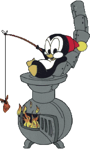
LastMinuteman wrote:Logos I HATE: anything drawn cartoon or comic book style.
I generally agree, but I have a hard time believing anyone could hate this:

YSU has the greatest logo in the NCAA. I mean, it's one freakin' badass, mean, pissed off penguin....who's possibly a little cold despite being a penguin. One word to describe the awesomeness that is the penguin: AWESOME!
Re: NCAA logos
Posted: Sat Feb 05, 2011 10:53 pm
by ODUalum11
Re: NCAA logos
Posted: Sun Feb 06, 2011 2:42 pm
by SuperHornet
Re: NCAA logos
Posted: Sun Feb 06, 2011 6:30 pm
by SouthDakotaGrizzly
BlackFalkin wrote:
PSU- Great creativity & simplicity but is not balanced, looks cool on helmet but should be balanced out in some way.
Great creativity?? It looks like someone with entry level photo shop skills and a lingering passion for the Mighty Morphin Power Rangers drew it up in their dorm room.
The thing I find odd about Montana's logo is that the grizzly is brown. I know, grizzlies are in fact brown, but usually a logo incorporates the school colors. But, I have seen versions of the same logo where the grizzly is maroon and it just doesn't look all that good. So, the brown was probably the right call, but it still strikes me as odd.
Re: NCAA logos
Posted: Sun Feb 06, 2011 10:09 pm
by Wildcat Ryan
LastMinuteman wrote:At first glance, the cat in Weber State's logo always looks to me like it's being sucked into an evil mirror. Like instead of leaping at me, it looks like it's reaching out for something to cling to. Anyone else get the intended sense of motion wrong, or is that just me?
Not until you mentioned it, now every time I look at my favorite logo, I see a Wildcat being sucked into an Evil mirror

Curse you